
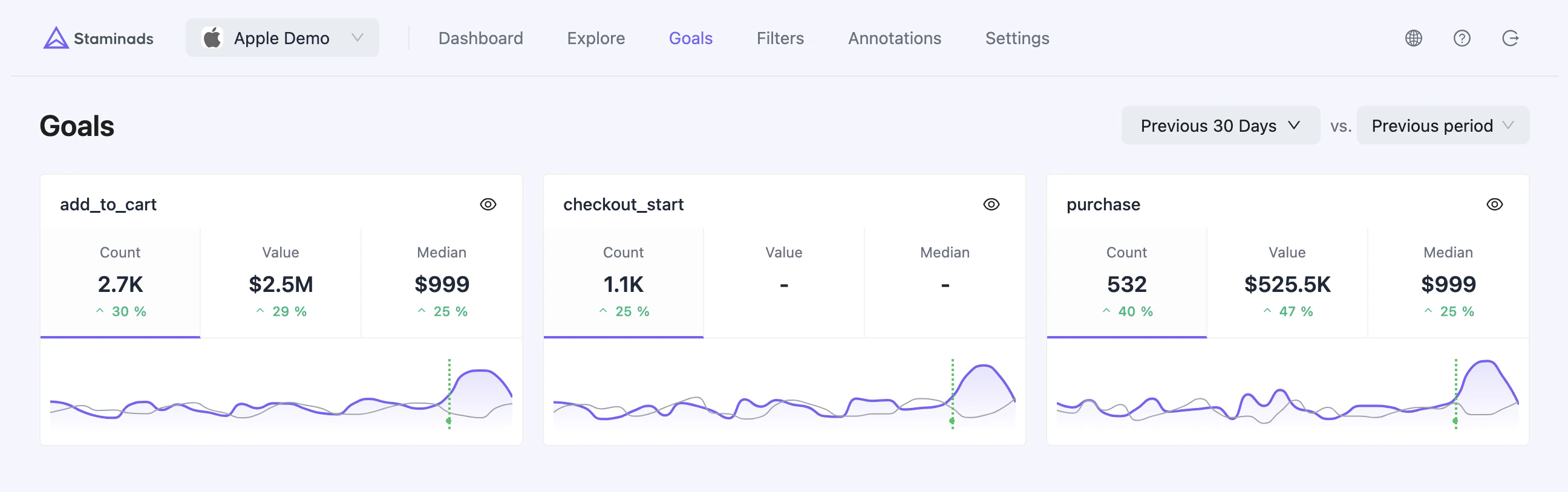
Goal Cards
Each goal is displayed as a card with three key metrics:
Click any metric to switch the mini chart to display that metric’s evolution over time.
When comparison mode is enabled, each metric shows the percentage change compared to the previous period.
Date Range & Comparison
Use the date picker to select a time period for analysis. Enable comparison mode to see how your goals are performing compared to the previous period. The mini charts on each card will show both the current period (purple line) and the previous period (gray line) when comparison is enabled.Goal Dashboard
Click the eye icon on any goal card to open the full goal dashboard drawer.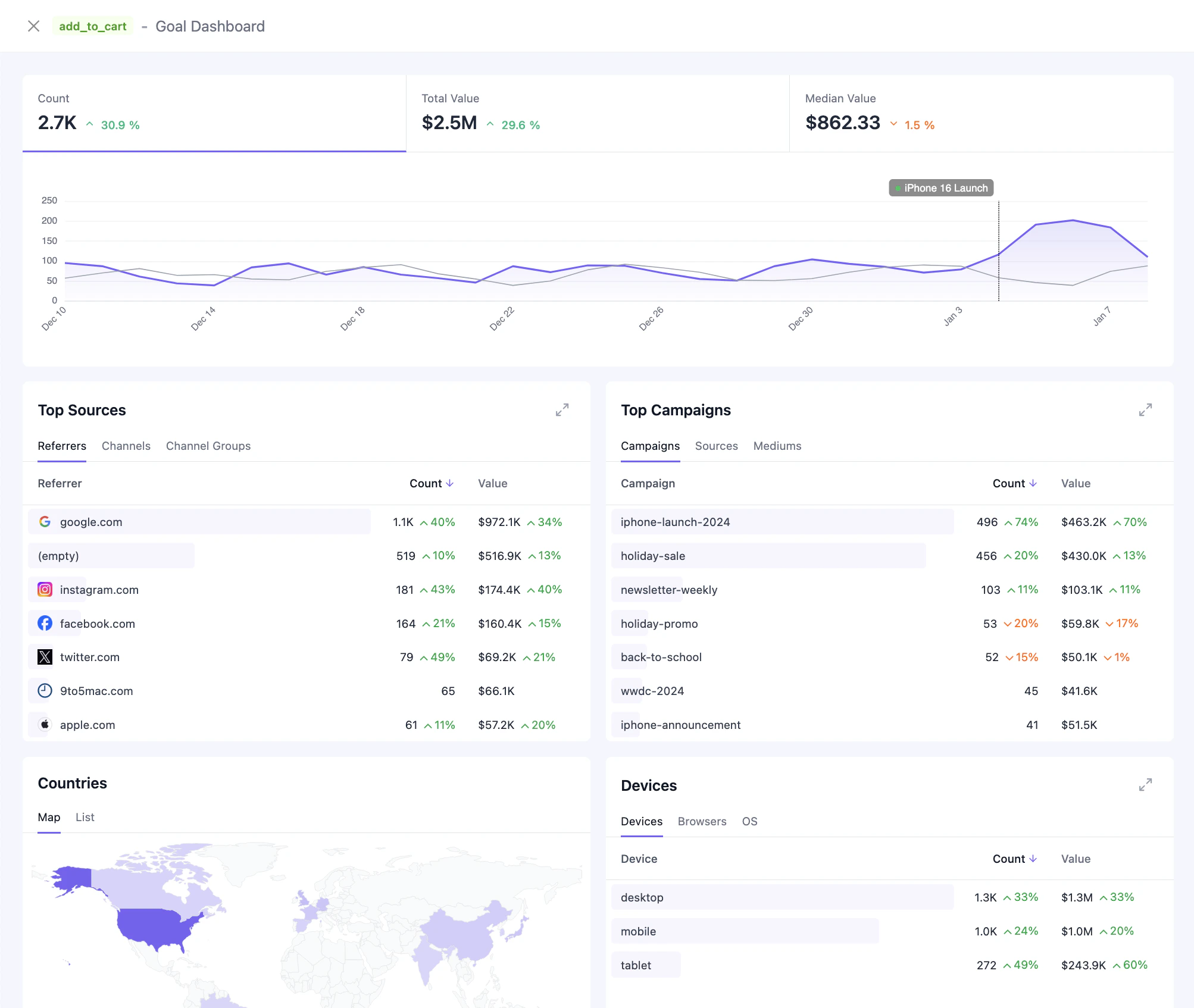
KPI Summary
The top section displays the three main metrics (Count, Value, Median) with comparison percentages. Click any metric to view its time-series chart.Time-Series Chart
Visualize the selected metric over time with:- Granularity based on date range (hourly, daily, weekly, monthly)
- Period comparison overlay when comparison mode is enabled
- Annotations showing significant events you’ve marked