
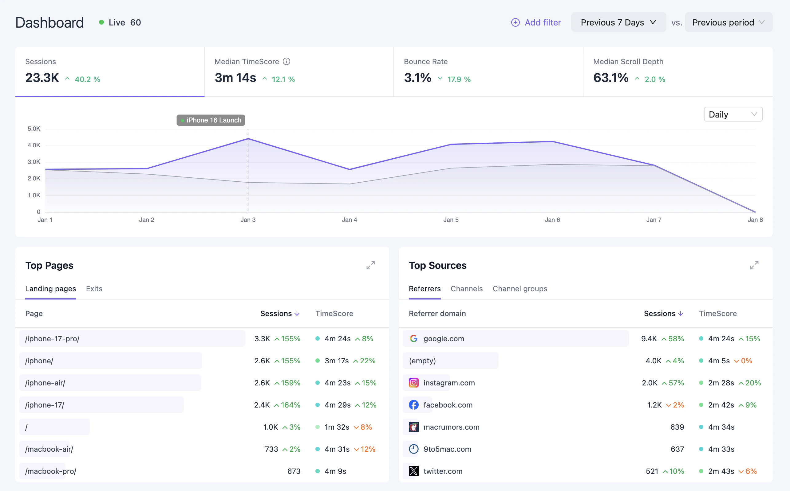
Date Range & Comparison
Use the date picker to select a time period for analysis. Available presets include Today, Yesterday, Last 7 days, Last 30 days, and custom ranges. Enable comparison mode to overlay the previous period on charts and show percentage changes on KPIs. This helps identify trends and measure performance over time.Key Metrics
The top row displays your main KPIs:
Click any metric to switch the time-series chart to that metric.
Time-Series Chart
The main chart visualizes your selected metric over time. Features include:- Granularity selector — Switch between hourly, daily, weekly, or monthly views
- Period comparison — Overlay previous period data when comparison mode is enabled
- Annotations — Vertical markers for significant events you’ve added
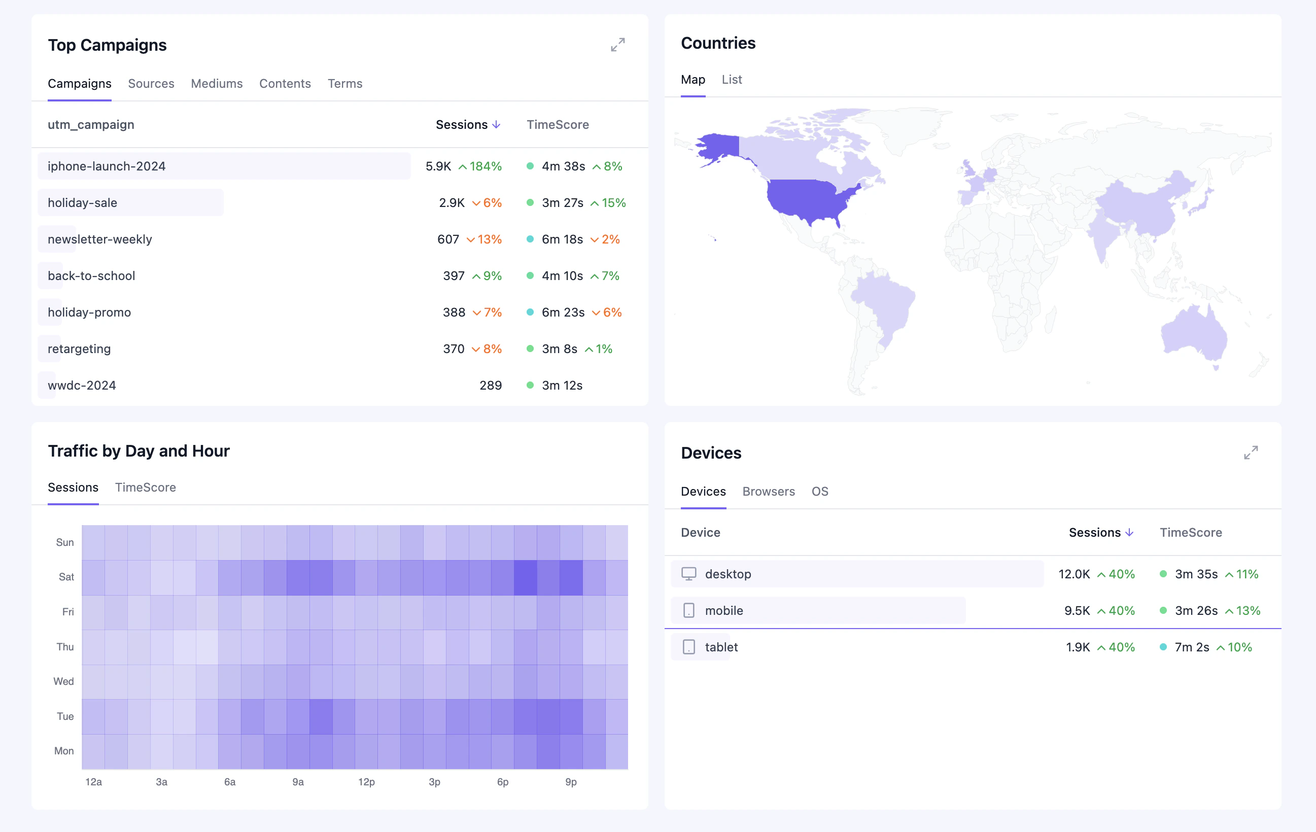
Widgets
Click-to-Filter
Click any row in a widget to instantly filter the entire dashboard by that value. For example:- Click a channel to see only traffic from that channel
- Click a country to focus on that geographic region
- Click a landing page to analyze traffic to that specific page
Real-Time View
Click the Live button next to the dashboard title to open the real-time view. This shows visitors currently active on your site in the last 30 minutes.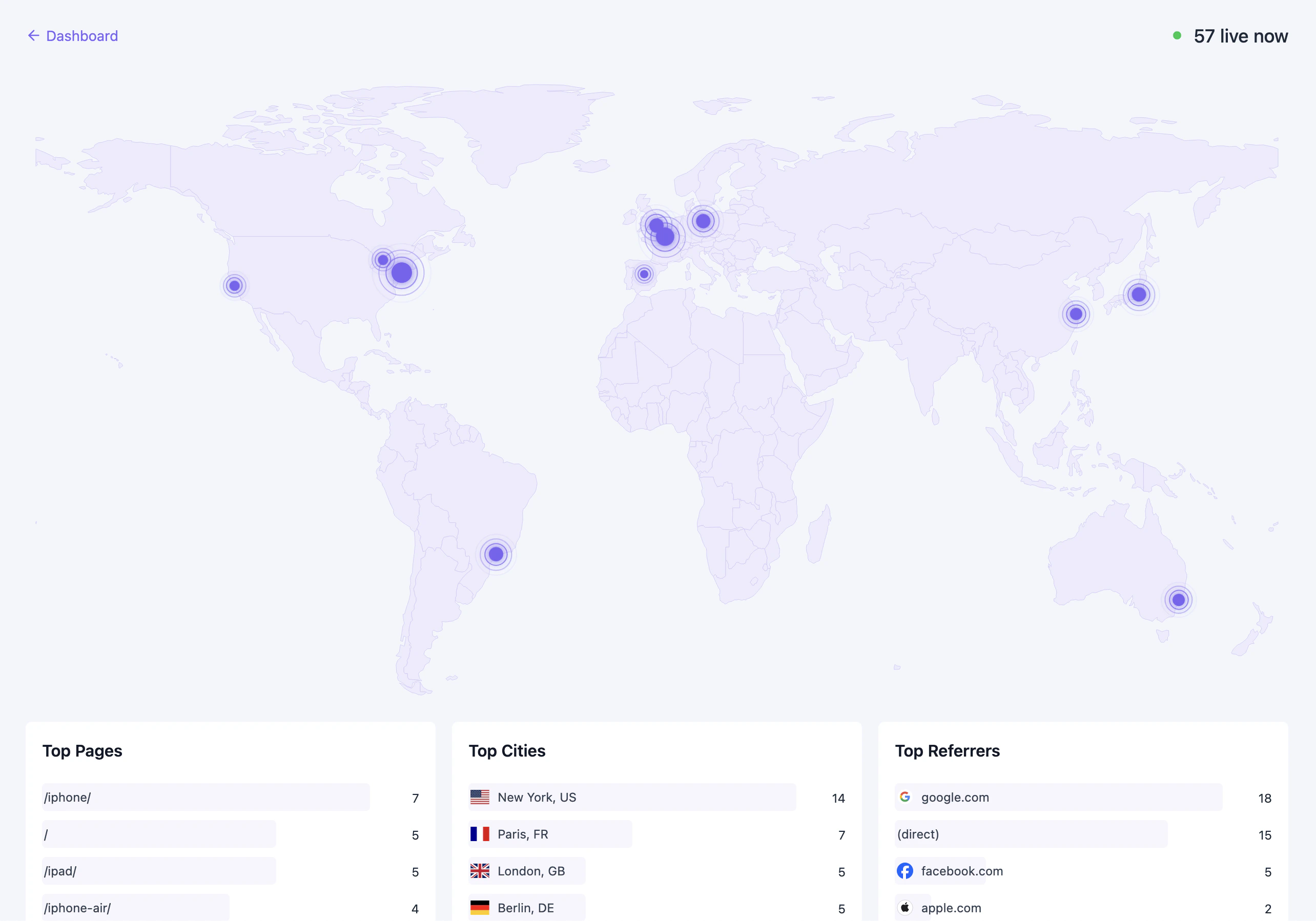
- World map — See where active visitors are located
- Live metrics — Current session count and engagement
- Active pages — Pages being viewed right now
- Live sources — Channels, referrers, and campaigns driving current traffic
- Devices — Real-time device and browser breakdown